What Are the Top Types of Decorative Paper Sheets in 2026?
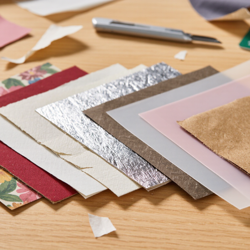
Decorative Paper Sheets can change the feel of a gift, scrapbook page, invitation, or product display with little more than color and texture. In 2026, popular choices include patterned, handmade, metallic, vellum, tissue, and kraft papers. Each brings a different look and handling experience. A matte floral sheet feels soft and understated; a foil finish catches light quickly. Some papers crease easily. Others need a sharper blade or more adhesive.
This guide explores the leading types and what they are suited to, from layered crafts to polished packaging. It also considers weight, surface finish, opacity, printability, and sourcing, because appearance alone does not tell the whole story. A sheet that looks beautiful online may arrive thinner, rougher, or less vivid than expected. Check product specifications and, where possible, order a sample before buying in quantity. Small details matter.
There is no universal winner. Needs vary.
Rather than treating 2026 trends as fixed rules, this overview focuses on practical selection and likely design preferences. Recycled-content claims, color consistency, and finish descriptions can differ between suppliers, so verify them with the seller. Even experienced makers misjudge a paper now and then. That is part of choosing materials well: test a fold, make a small print, and see how the sheet behaves in real light.
How Decorative Paper Sheets Are Classified by Finish, Fiber, and Function
Decorative paper sheets are best compared through three practical lenses: surface finish, fiber content, and intended use. A matte sheet softens glare and suits writing or understated invitations, while gloss can make printed colors appear sharper. Embossed, linen-like, and pearlescent finishes add texture or shimmer, but deep patterns may make fine lettering harder to read. Small details matter.
Fiber changes how a sheet bends, tears, and holds ink. Wood-pulp papers suit many everyday projects; cotton-rich sheets often feel softer and may handle repeated use well. Recycled content can vary in shade and surface, so inspect a sample rather than relying on a label alone. Weight is not the whole story. Fiber blend and sizing also affect stiffness and absorbency. That distinction gets missed.
Function narrows the choice. Lightweight sheets fold neatly around gifts, while heavier stock offers more support for covers, cards, or display pieces. For ink-heavy artwork, test drying and feathering on the actual sheet; coatings behave differently. Check grain direction before scoring a fold, especially on thick stock. I still find that easy to overlook. Matching finish, fiber, and function ties appearance to performance, not just first impressions.
Printed and Patterned Sheets: Color Control Under ISO 12647
What Are the Top Types of Decorative Paper Sheets in 2026?
Printed and patterned decorative sheets depend on more than attractive artwork. Their colors must remain consistent across runs, substrates, and viewing conditions. ISO 12647 provides process-control guidance for print production, but it does not make every paper behave alike. A warm, uncoated sheet may soften cool blues, while a coated surface can make the same ink appear brighter. Paper shade, coating, ink absorption, and printing method all affect the result. Small differences matter.
A reliable workflow starts with a suitable color profile and a proof made on a representative paper. Printers can check calibration, measure color patches, and compare results under consistent lighting. Keep an eye on fine lines and repeating motifs; slight registration shifts can make a pattern look uneven. ISO-based controls improve repeatability, not perfect visual matching. Even a carefully prepared file can disappoint when the production stock changes. That is worth checking early.
Tips: Approve a physical proof on the intended paper. Record the stock, finish, and lighting used for approval. For patterned sheets, inspect both a solid color patch and a full printed repeat. Look closely. A small variation may be acceptable, but it should be noticed and discussed before the full run.
Top Types of Decorative Paper Sheets in 2026
Typical paper grammage ranges for commonly used decorative sheet types
How to read this: Bars show typical commercial grammage ranges in g/m²; actual offerings vary by supplier and application. ISO 12647 provides process-control principles for print colour reproduction—it does not prescribe paper types or grammage. Because paper shade, coating, and texture affect the printed result, colour control should be checked on the intended stock.
Textured and Handmade Papers: Compare Basis Weight Using ISO 536
Decorative paper can look substantial without being heavy, so compare textured and handmade sheets by basis weight, usually stated in grams per square metre (g/m²). ISO 536 provides a method for determining paper and board grammage: a known area is weighed, and its mass is calculated per square metre. It measures mass, not thickness, stiffness, or surface quality.
That distinction matters with deckled edges, raised fibres, and uneven handmade surfaces. A rough sheet may feel thick but have a moderate basis weight; a dense, smooth sheet can weigh more. For a fair comparison, use representative samples, the same units, and consistent conditioning. Avoid judging from a tiny offcut. Handmade sheets can vary across one sheet, so a single measurement may not tell the whole story. This is easy to overlook.
When choosing paper for invitations or layered artwork, check the stated g/m² alongside a physical sample. Note how it folds, accepts ink, and sits beneath another sheet. If precision matters, ask how the value was measured and whether several samples were tested using ISO 536. A published number is useful, but it cannot describe every tactile detail. There is some uncertainty here: natural variation is part of handmade paper, not necessarily a defect.
Metallic and Foil-Finished Sheets: Assess Coating and Surface Performance
Metallic and foil-finished decorative sheets can look flawless under showroom lights and disappoint under handling. Check the coating at several angles: streaks, pinholes, and uneven gloss often appear when light moves across the sheet. Press a fingernail lightly near an edge, then fold a sample slowly. Cracking or flaking suggests the finish may not tolerate converting or repeated use. Looks are not enough.
Two Sides’ 2023 Trend Tracker surveyed 10,000 consumers across 16 countries and reported that 55% preferred paper packaging over other packaging materials. That preference does not guarantee demand for foil finishes, but it raises the bar for combining appearance with a credible paper substrate. Smithers’ The Future of Global Packaging to 2028 forecast the packaging market would reach $1.3 trillion by 2028, reflecting the scale of competition for attention across packaging formats. Treat those figures as market context, not proof of coating durability.
For practical screening, compare uncoated and finished samples under the same light, then test rubbing, folding, and surface adhesion using a consistent method. ASTM D5264 provides a rub-testing framework for printed materials; it can help reveal whether metallic pigment transfers or gloss dulls. Record the result after each test. A small sample may still miss batch variation, so request production-lot samples before approving a finish.
Archival Decorative Paper: ISO 9706 Sets pH 7.5–10 and a 2% Alkali Reserve
Decorative paper in 2026 can include cotton-rich sheets, textured wood-pulp paper, handmade stock, and embossed finishes. For keepsake albums or certificates, appearance is only part of the choice. ISO 9706:1994 specifies a pH range of 7.5–10 and an alkaline reserve equivalent to at least 2% calcium carbonate. These measurable requirements help distinguish permanent paper from stock chosen mainly for color or texture.
The reserve helps neutralize acids that may form as paper ages. A bright sheet is not automatically archival. Nor does a “natural” surface prove lasting quality. Check the supplier’s technical data for pH, reserve, and the test standard used. ISO 9706 also includes strength requirements, so pH alone cannot establish compliance. In practice, a richly embossed sheet may look beautiful but feel too brittle for repeated handling. That trade-off deserves thought.
Tips
Ask for a specification sheet, not just an “acid-free” claim. Confirm that the reserve is calcium-carbonate equivalent and at least 2%. Store sample sheets away from direct sunlight, and test folds gently before using them in a bound project.
